this is my 4 pannel digipak that I made for the music video that I created
this is my magazine advert for my digipak and the music video
One of my most important conventions in my music video is the story line of my music video. I focused on trying to create a good story that the audience could relate to and possibly feel a little emotional about it. I got inspiration for the story line off other music videos that are about love such as Taylor swift- mine, Moulin rouge- come what may and even the original video for A Thousand Years by Christina Perri. The original of boy meets girl and they fall in love. However I wanted to change how love music videos normally end where traditionally the boy gets the girl or the girl get the boy I decided to have it so it didn’t end happily and in fact they break up and hence why the girl is singing so emotionally and dramatically. I thought this would be more relatable story as not all relationships end well and it can leaves one person in love still and this is what my music video shows. Another similarity of my music video to other music videos is certain scenes that I have used that I got inspiration off other music videos.
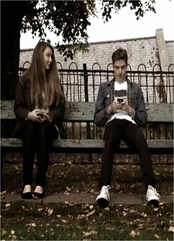
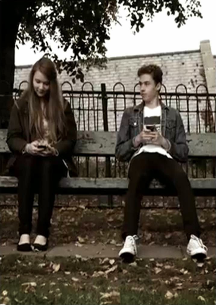
A music video that I got inspiration from for the scene of
sitting on the bench with someone is from another Taylor swift song called You
Belong with Me. The idea was the boy looks at the girl when the girl isn’t
looking and the girl looks at the boy when the boy isn’t looking, sort of a
cute start to a relationship as everyone wants to feel as though someone they
like is looking at them. So it links in with the start of a love story.

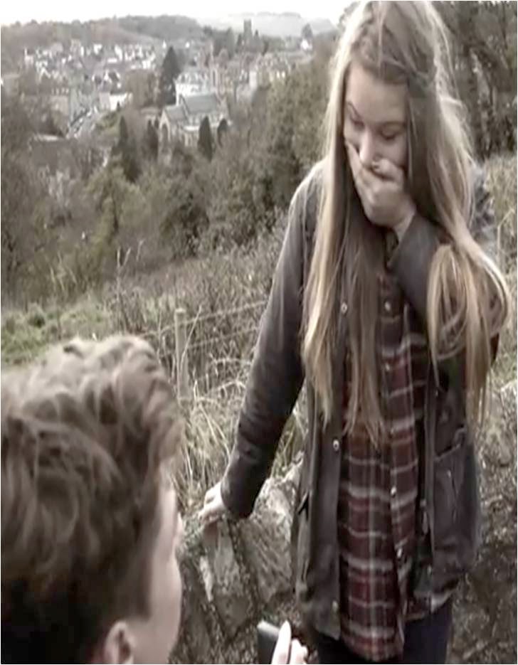
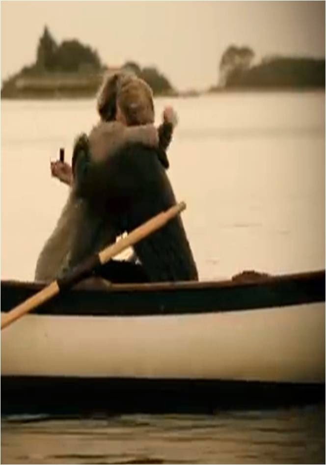
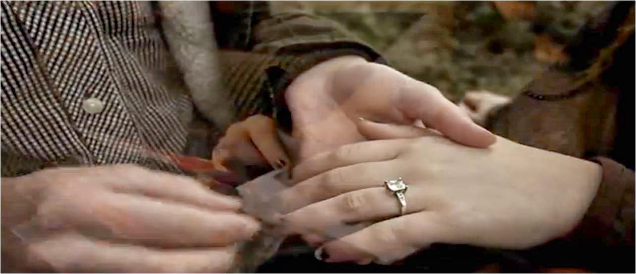
Another music video Taylor swift- mine I have used some of the body movements and postures. The scene I focused on here was the engagement scene where as you can see the proposal scene is very alike. I liked the way the girl looks shocked with the hand over the mouth, them both hugging and then the close up of the ring getting put on the finger. I feel as though it moves very swiftly between the clips and I think is the best way to sum up what happens in an engagement.
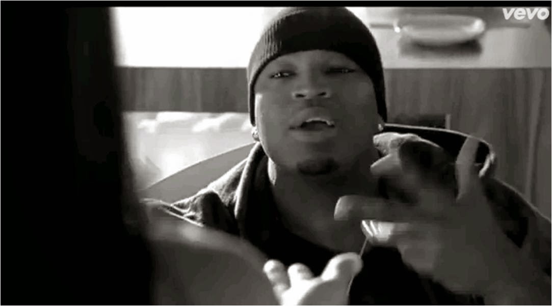
The music video by Ne-Yo called Mad it has the same close ups of the faces of the actor and actress when they are arguing to see the emotion. I find this a very effective technique as the audience can see the facial expression of both of them, gives it the look of a more realistic argument. These examples show how similar my music video is to other music video.
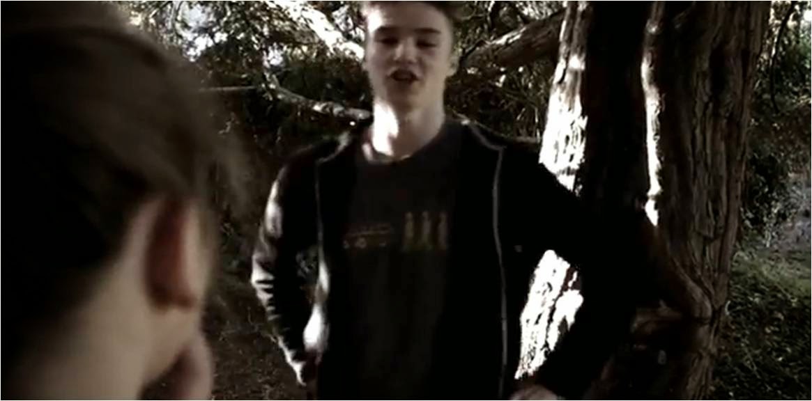
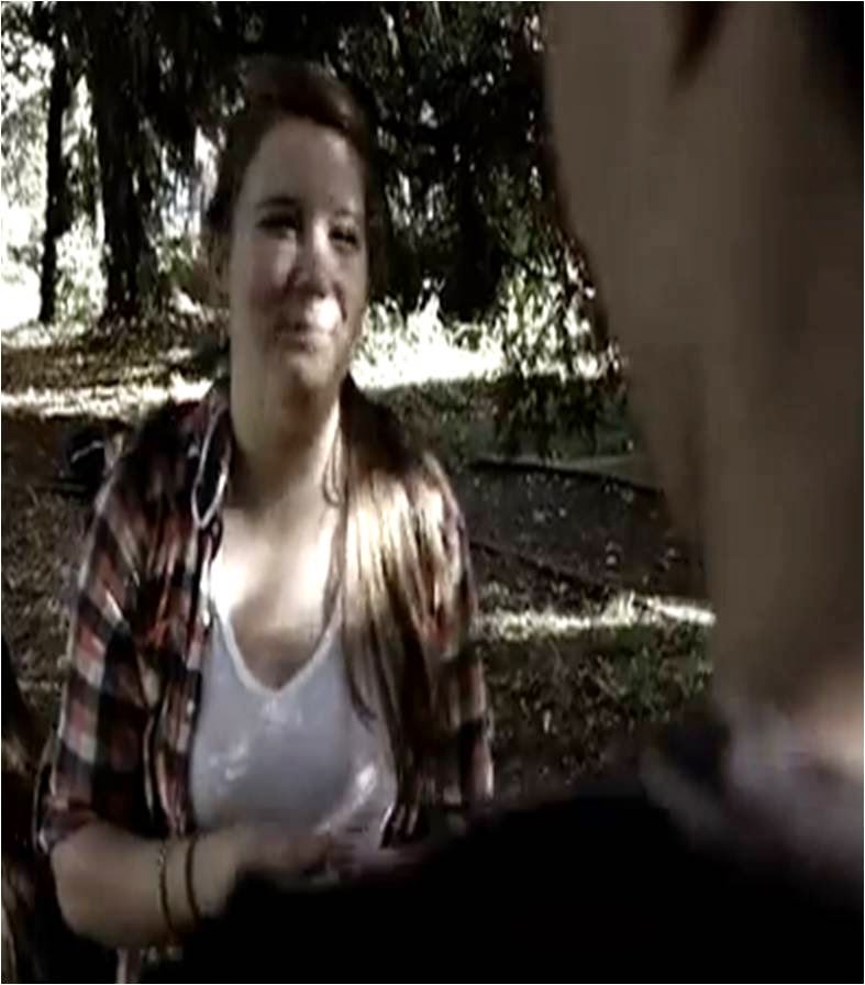
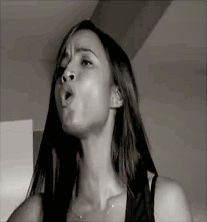
Now the difference of my music video to other music videos is during the lip singing the girl is in different place of the room with different angles showing her singing every time she comes onto the screen showing that she is moving around. I did this because what normally happens is that when an artist is lip singing as well there being a story line so it doesn’t get too confusing for the viewer the artist stays in the same place with the same angle. But i found that boring. However even though its different places it is still in the same room, the artist is wearing the same clothes so it looks as though they belong together even though they were filmed on two separate days.
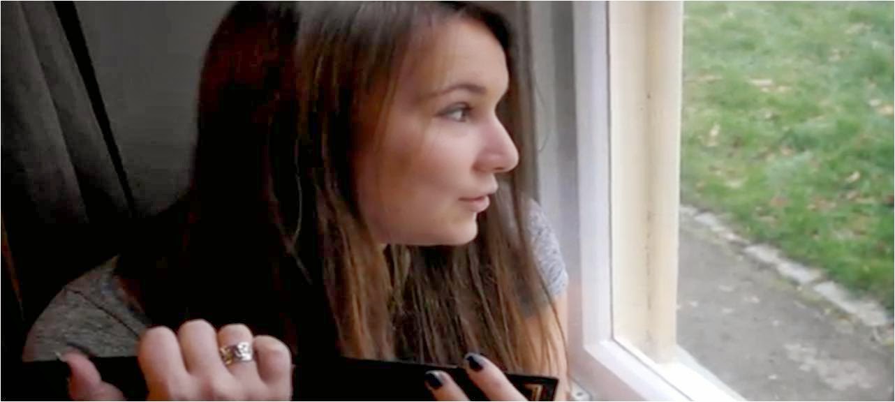
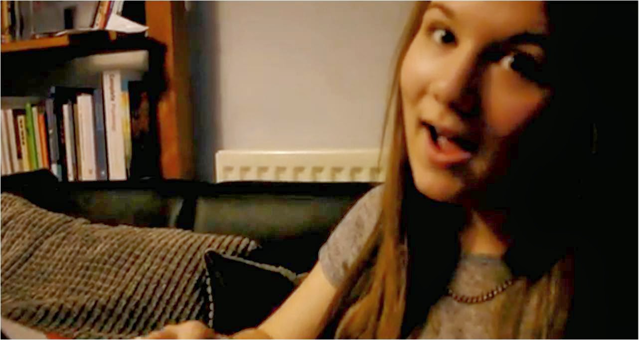
I believe that the combination of my ancillary tasks and my media product works very well together. I have kept a house style throughout both pieces of work so the audience can see a link between the digipak and the magazine advert for it . the synergy between the main product and the ancillary task is that I have used the actresses that is in my music video as the face of both my ancillary tasks and also the girl is in the same location in these shots as she is in the music video and in fact for an image that is on my digipak I screen shotted an image from the actual video to create more synergy between both media product and ancillary tasks. On the digipak I have the coloured images on the outside and on the inside it is black and white I have chosen to do this because it links in with the song that I have created my music video for. As the whole song is about being strong on the surface and looking happy which is what she is doing yet on the inside she feels alone and hurt and I have shown this by her sitting by herself on a bench looking upset. This has been also linked in with the magazine advert by the inside of the digipak being the main background for the poster and having the front of the digipak showing on the magazine advert as a small square so its obvious to see but not so big that it takes the attention away from the back ground. I was also able to get feedback on how effective my main product is combined with my ancillary texts
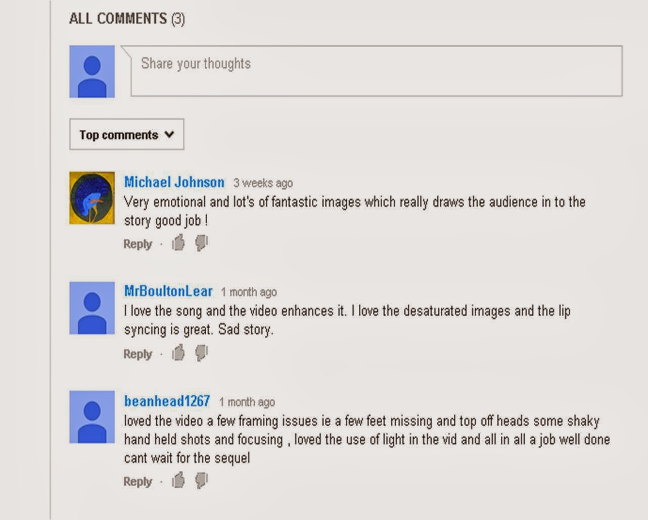 From audience feedback that I have got off YouTube where I
have put my music video I have found what the public have actually thought as
they commented. The first comment which is from
‘beanhead1267’ saying that they ‘loved the video, a few framing issues
ie. A few feet missing and tip of heads some shaky hand held shots and
focusing. Loved the use of light in the vid and all in all a good job well done
cant wait for the sequel. The next comment was from MrBoultonLear who said they
loved the sing and the video enhances it. He loves the desaturated images and
the lip syncing is great. Sad story. And the final comment from Michael Johnson
who said it is a very emotional and lots of fantastic images which really draws
the audience in to the story good job. These comments have shown me that the
audience likes the story that I have created in my music video and overall it
is a good video however there are some issues in my music videos that are to
due to camera hand held shots.
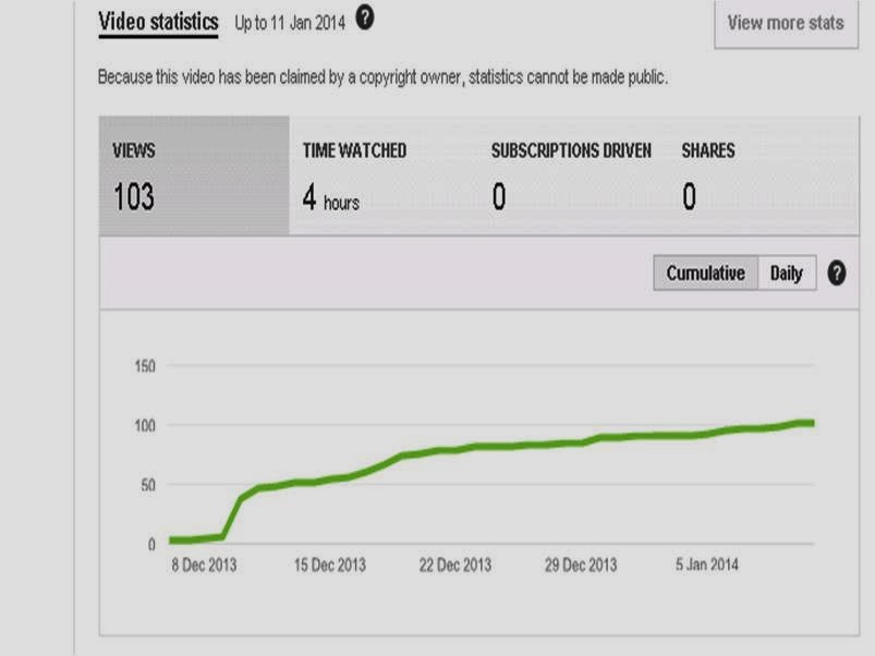 From the demographics off YouTube I have found
out that the majority of the people who
watch my video are males taking up 57% of my viewers which means that
previously in my blog posts when I predicted that the majority of viewers would
be female I was wrong even though the original videos main viewers
are female . I also found out that the viewing of my video wasn’t just from UK
but also from countries like Canada, Austria, Indonesia and Spain thus meaning
that the song I have chosen is well known but also that my music video has some
entertain element to be watched. My music video has 103 views and the amount
time it’s been watched is 4 hours. I also have 4 likes on my video which tells
me that people like how I have done my music video. So overall what I have learnt
from all the feedback is that possibly I should use a tripod while filming all
of the shots as the camera in places in unnecessarily shaky at times which puts
the viewer off the actual story. Also at places where it is blurry because the
camera wouldn’t focus properly I should retake though images so I can have clearer
images so people will follow the storyline. Another factor that I have learnt
from is the framing of the shots, I think possibly more long shots or mid shots
could be used and also the rule of thirds to be put into place so during
filming no heads or feet will be cut off.
Throughout the planning and research and creating my final
product I have used media technologies. I have put all my whole portfolio on
blogger which enables me to put text, images, videos and also
use HTML codes to link a YouTube video to my on line blog. In these blog posts I have included
prezzi’s, documents, slide share and also the use of video.
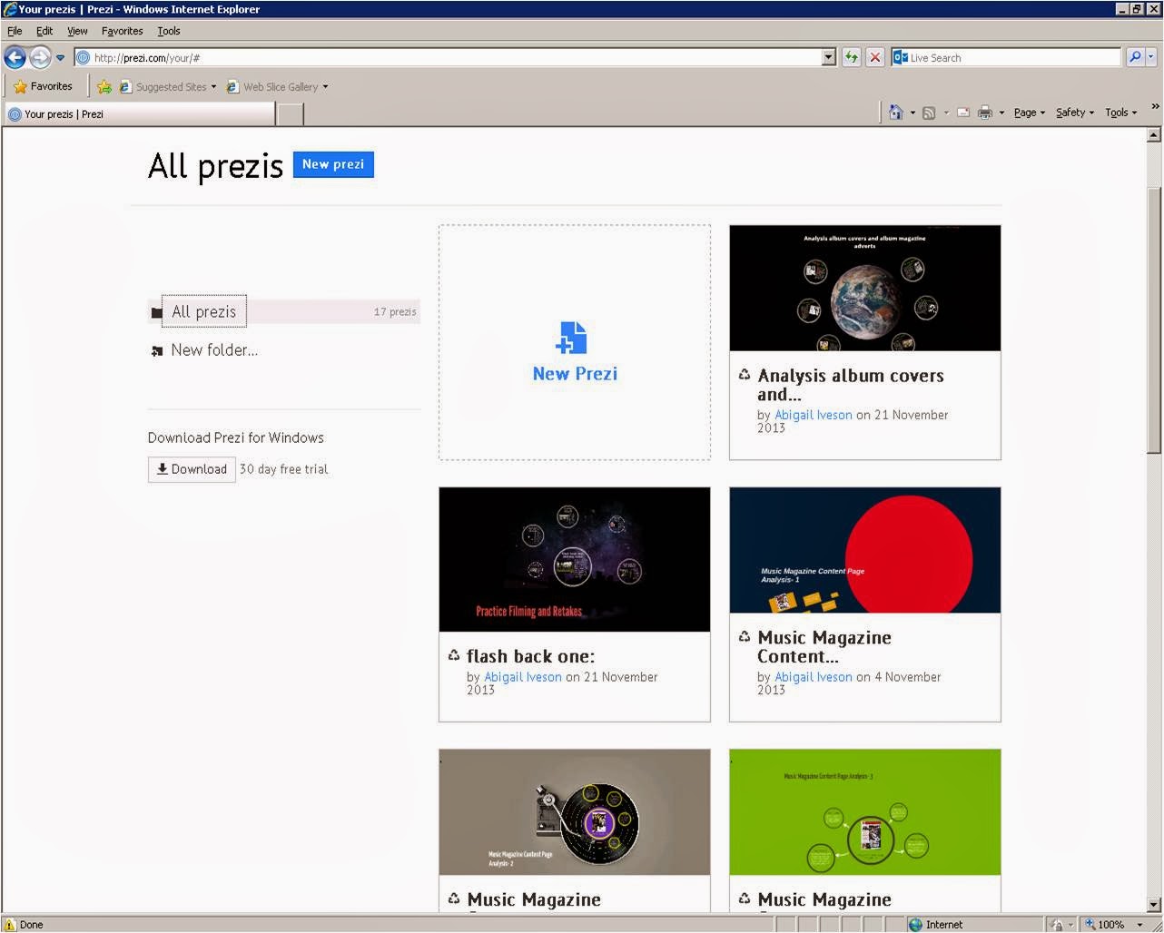 The online site
called prezi is where I was able to create an interactive presentation, these
interactive presentation allowed the audience to zoom in and out when at
different sections. To create a prezi I had to include images and text and
place it in the correct section. This is the easiest and an entertaining way to
upload posts such as lip singing, and digipak analysis without creating a blog
post full of lots of writing, which can become tedious to read.
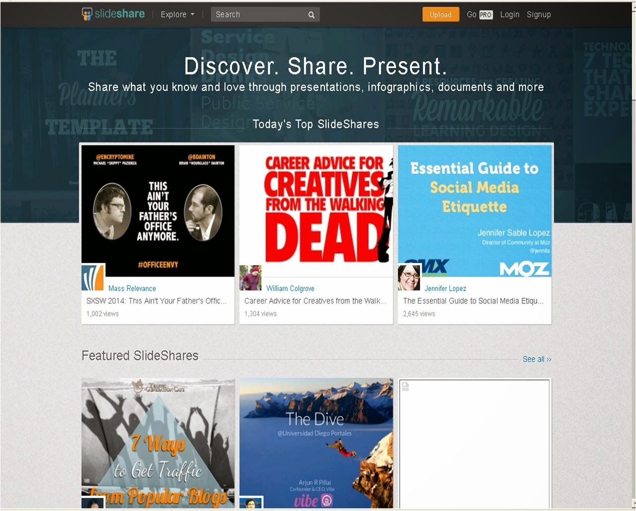 Another online
site called slide share where I created more blog posts that are interactive
again, the way that this is interactive is that the viewer can move from slide
to slide. The way in which I created
slide shares was so the audience is able to view how I created my ancillary
texts step by step. I find this a better way of presenting my work as it’s a
quick way someone can view the creation. also uploading it on to blogger was a very easy task to do. i had never used slide share before but it was very easy to get the hang of it.
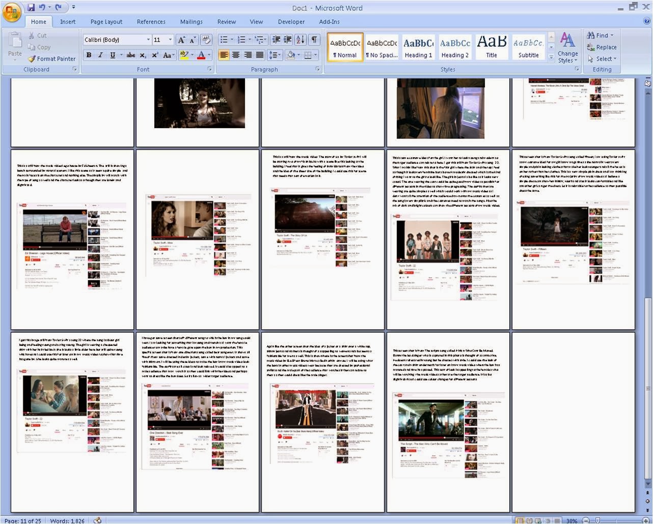 The use of documents like Microsoft
word I had to use because the blogger had some technical difficulties. I had to
import these documents after screen shooting them, cropping it in paint and
saving it as an image. This means saving them in JPG and finally importing it
in blogger as a post. This is also a similar way of how I uploaded images on to
my blogger as well. This was a more difficult way of writing blogs. the picture on the left shows me using Microsoft Word to write up my blogs that i was needing.
the image above is blogger that i have used throughout creating my media product. this has to be the most useful technology that i worked with because i was able to put all of my planning, research and actual media product on to. it was very easy to use and easy to access from anywhere.
the image on the right is showing me using paint and the image below shows how imported photos and images into my blogger. this was a long process to go through. i would of much preferred to just write it on the blog and the majority of the time i was able to do this. however even though it took so long it helped me learn how to use other technologies which i hadn't used before like paint.
 Another
media technology that I have used is creating a video for my evaluation so over
all I can have a broad use of media. I also thought that it would be a lot easier
to watch then having to read pages of writing. I filmed the video using my
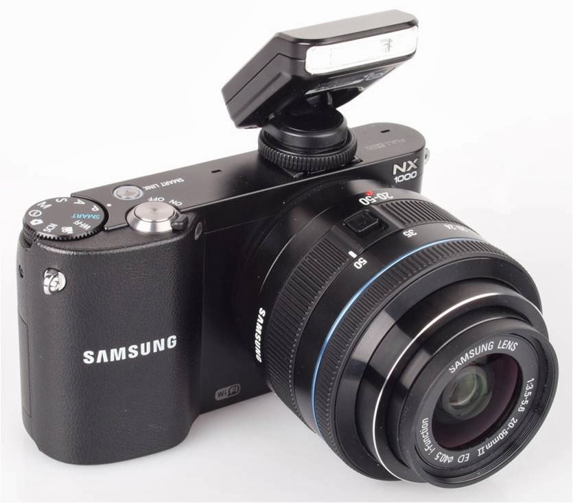
mobile phone which has a 13 mega pixels HD camera on it. I used a Samsung
nx1000 camera to record all of my footage for my music video. Some of the
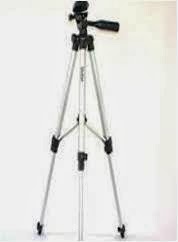
recordings were done with a tripod while the majority was done just by hand. Unfortunately
the hand work was shaky which lead to the majority of the criticism that I
received from the audience feedback.
I
feel as though overall my media product with the ancillary tasks has come
together positively using synergy throughout which I feel strengths the final
product. The way that I have produced each product is quite simple which matches
the genre of song that I have chosen, my music video has mainly got
positive responses especially to the
story line which has been called “cheesy” by the male actor in the video which
is what I was trying to aim for. Both my digipak and magazine advert I have
created has put the genre and what the song represents on paper through images
confidently. The online site
called prezi is where I was able to create an interactive presentation, these
interactive presentation allowed the audience to zoom in and out when at
different sections. To create a prezi I had to include images and text and
place it in the correct section. This is the easiest and an entertaining way to
upload posts such as lip singing, and digipak analysis without creating a blog
post full of lots of writing, which can become tedious to read.
 Another online
site called slide share where I created more blog posts that are interactive
again, the way that this is interactive is that the viewer can move from slide
to slide. The way in which I created
slide shares was so the audience is able to view how I created my ancillary
texts step by step. I find this a better way of presenting my work as it’s a
quick way someone can view the creation. also uploading it on to blogger was a very easy task to do. i had never used slide share before but it was very easy to get the hang of it.
  The use of documents like Microsoft
word I had to use because the blogger had some technical difficulties. I had to
import these documents after screen shooting them, cropping it in paint and
saving it as an image. This means saving them in JPG and finally importing it
in blogger as a post. This is also a similar way of how I uploaded images on to
my blogger as well. This was a more difficult way of writing blogs. the picture on the left shows me using Microsoft Word to write up my blogs that i was needing.
The use of documents like Microsoft
word I had to use because the blogger had some technical difficulties. I had to
import these documents after screen shooting them, cropping it in paint and
saving it as an image. This means saving them in JPG and finally importing it
in blogger as a post. This is also a similar way of how I uploaded images on to
my blogger as well. This was a more difficult way of writing blogs. the picture on the left shows me using Microsoft Word to write up my blogs that i was needing.the image above is blogger that i have used throughout creating my media product. this has to be the most useful technology that i worked with because i was able to put all of my planning, research and actual media product on to. it was very easy to use and easy to access from anywhere.
the image on the right is showing me using paint and the image below shows how imported photos and images into my blogger. this was a long process to go through. i would of much preferred to just write it on the blog and the majority of the time i was able to do this. however even though it took so long it helped me learn how to use other technologies which i hadn't used before like paint.

 Another
media technology that I have used is creating a video for my evaluation so over
all I can have a broad use of media. I also thought that it would be a lot easier
to watch then having to read pages of writing. I filmed the video using my
mobile phone which has a 13 mega pixels HD camera on it. I used a Samsung
nx1000 camera to record all of my footage for my music video. Some of the
recordings were done with a tripod while the majority was done just by hand. Unfortunately
the hand work was shaky which lead to the majority of the criticism that I
received from the audience feedback.


